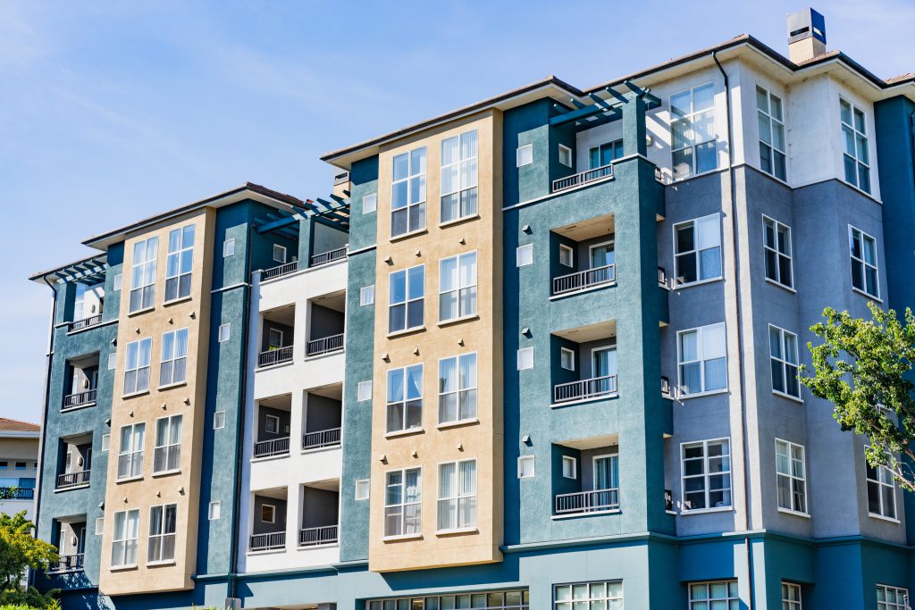
Finding the ideal exterior paint colors for commercial buildings is about making the right impact! Many business owners in Great Falls, VA, and other surrounding areas struggle with selecting a color that reflects their brand and appeals to customers. We created this guide to help you navigate through these choices effectively.
Whether you’re updating an existing property or painting a new one, the right color choice can significantly influence customer perceptions. This article will cover essential tips on color psychology and practical advice on choosing the best colors for your next exterior commercial painting project.
Understanding Color Psychology in Commercial Design
Have you ever noticed how some buildings instantly draw your attention? Much of this effect comes from the colors they use. Colors influence people’s feelings and behavior, making them a key element in commercial design.
Choosing the right exterior paint colors for commercial buildings sends a strong message about your values and the ambiance you want to project. We will explore how different colors can affect moods and behaviors, helping you select a color scheme that best represents your business.

Best Exterior Paint Colors for Commercial Buildings
Choosing the right exterior paint colors for commercial buildings is more than a matter of style—it’s about making the first impression count! The colors you select can influence customer perception and even their decision to enter your premises. Here are some of the best color options to enhance your building’s appeal and effectively reflect your brand’s personality.
Red
When you choose red for your commercial building, it’s all about making a bold statement. Red is a powerful color that grabs attention and can give your building a lively, energetic vibe. It’s perfect for businesses that want to stand out and leave a lasting impression.
Blue
Blue is a great choice for exterior paint colors for commercial buildings when you want to promote trust and calmness. It’s often used by financial institutions and healthcare facilities to convey security and tranquility. Blue can help create a serene environment that welcomes everyone.
Green
Green brings a touch of nature to your commercial property, making it feel fresh and inviting. It’s an excellent choice for buildings in natural settings or businesses promoting health and sustainability. This color can help put clients at ease the moment they see your building.
Orange
Orange is warm and friendly, ideal for creating a welcoming atmosphere. It’s vibrant and can stimulate social interaction, making it a great choice for places like cafes and boutiques. If you want your commercial building to feel approachable, consider orange.
Yellow
Yellow shines with optimism and can make your commercial building eye-catching. It’s perfect for attracting attention from afar and radiating a positive, cheerful ambiance. Use yellow to energize and uplift.
Brown
Brown offers a sense of stability and reliability, which can be very appealing in a commercial setting. It’s often chosen for professional offices and complexes where a subtle, grounded appearance is preferred. Brown helps convey a sense of seriousness and dependability.
Black
Black is sleek, powerful, and full of sophistication. It makes a dramatic impact and can give any commercial building a modern, upscale look. If you’re aiming for an elegant and authoritative presence, black is the way to go.
White
White is versatile and clean, making it a popular choice for many different types of commercial buildings. It can help make smaller buildings appear larger and stand out with crisp clarity. White is often used to create a minimalist aesthetic that speaks of simplicity and efficiency.
Sector-Specific Color Recommendations
When selecting exterior paint colors for commercial buildings, it’s essential to consider the specific needs and goals of different business types. The right color choice can not only enhance the aesthetic appeal of a building but also support the functional requirements and industry standards. Let’s explore some color guides for commercial buildings and sector-specific color recommendations that help businesses in various industries convey the right message and create the desired impact on customers and visitors.
Choosing Complementary and Accent Colors for Commercial Buildings
Selecting the right complementary and accent colors enhance the overall appearance of your commercial building. Understanding the principles of color harmony can help you create a visually appealing exterior that stands out. It’s all about finding colors that work well together and enhance the main hue without clashing.
When choosing accent colors for exterior paint colors for commercial buildings, consider the impact you want to achieve. Accent colors should highlight architectural features and draw attention to entrances or other key areas. They can be bolder or more subdued, depending on the statement you want to make.
Keep in mind, the best choices often come from the color wheel. Adjacent colors harmonize smoothly, while opposite colors create vibrant contrasts. Whether you’re aiming for subtlety or boldness, the right accents can significantly elevate the look of your commercial property.
Final Thoughts
Choosing the right exterior paint colors for commercial buildings is a big decision. Always start by sampling various colors directly on the building’s exterior. This allows you to visualize how different shades will look throughout the day under varying light conditions.
It’s also wise to consult with professional painters, especially those familiar with the specifics of commercial properties in your area. For instance, if you’re in the McLean or North Potomac areas, local experts can provide insights tailored to the local climate and architectural styles.
JC Custom Painting LLC is dedicated to helping you find the perfect color for your business. We understand the importance of keeping you informed throughout the process. For hassle-free commercial painting services, call us at 571-575-6818 for a FREE estimate! We’re here to ensure your building looks its best and reflects the quality and professionalism of your business!

