
Wall paint colors are easier to choose when you stop treating each room as a separate decision. In a Vienna home, hallways, stairwells, open doorways, trim, flooring, cabinets, and nearby rooms all affect how one wall color relates to the next.
A stronger approach is to build a whole-home palette first, then decide which rooms stay quiet and which can carry more color. That keeps the house connected without forcing every room to use the same shade.
Build the Palette Before You Pick the First Room
A whole-home palette does not mean painting every room the same color. It means choosing a small group of colors that work together as you move through the house.
Start with the spaces that connect the most rooms, such as hallways, stairwells, foyers, or open living areas. A flexible base color in those areas can give you more freedom to use stronger color in bedrooms, offices, dining rooms, or other enclosed spaces.
This approach makes each room feel intentional while keeping the transitions from one space to the next easier on the eye.
Let Fixed Finishes Set the Boundaries
Flooring, kitchen cabinets, countertops, tile, stone, fireplaces, and existing trim are harder to change than wall color. Use those materials to eliminate paint undertones that do not belong in the room.
A warm wood floor can make one gray look blue, while cooler stone can make a beige appear more yellow. Compare the wall samples directly beside the finishes that will remain instead of judging them on an empty wall.
If cabinets or trim are also being repainted, choose those colors at the same time so the full combination works together.
Use Sightlines to Decide Where Color Can Get Stronger
Stand in the hallway, at the bottom of the stairs, and in the main doorways. Those views show which rooms are visible together and which spaces can carry a different color without competing with the room beside them.
A deeper dining room or office can work well when it is framed by a doorway and balanced by a quieter connecting space. Two strong colors facing each other across an open plan can feel much busier.
Use those sightlines to decide where you want contrast and where you want the palette to settle down.
Use Undertones to Keep Different Colors Related
You can use several wall colors without making the home feel disconnected. One way is to keep the undertones related even when the colors themselves are different.
A warm neutral hallway, muted green office, and deeper clay dining room can work together when the underlying warmth is similar. Mixing a strongly cool gray, yellow beige, and red-toned brown in one connected view is harder to balance.
When two samples seem close, compare them beside the same trim, floor, or cabinet finish. The undertone difference usually becomes easier to see.
Use 2026 Color Picks as Palette Ideas, Not Instructions
Current manufacturer selections show how broad a modern palette can be. Sherwin-Williams chose Universal Khaki SW 6150 as its 2026 Color of the Year, a warm mid-tone neutral with a slight yellow undertone.
Sherwin-Williams presents Universal Khaki as a neutral that can sit beside natural finishes, white, or stronger accent colors.
That is more useful than treating the color as a rule. A warm neutral can anchor the connecting spaces while another room takes on a deeper green, blue, clay, brown, or other accent direction that fits the home.
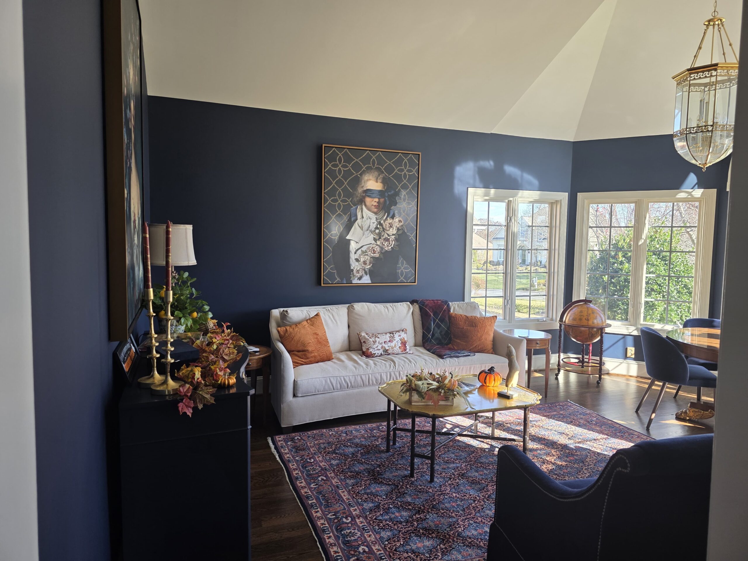
Choose Stronger Color Where the Room Can Support It
Deeper wall colors can work in dining rooms, offices, bedrooms, libraries, or other spaces where a more enclosed feeling fits the room. The decision should come from the lighting, furniture, trim contrast, and the mood you want, not from a rule that dark colors only belong on accent walls.
Before committing, check how the darker color looks from outside the room. A color that feels balanced inside the space can appear much stronger when viewed through a doorway beside a lighter hallway.
That doorway view is one of the easiest ways to decide if the color belongs in the larger palette.
Test the Palette as a Group, Not One Sample at a Time
Once you have finalists, place samples for connected rooms where you can see them together. Check the hallway color beside the living room, the kitchen color beside the dining room, and the trim color beside all of them.
View the samples in morning light, later daylight, and under the lights you normally use at night. You are looking for a group of colors that continues to work as the conditions change.
Do not judge only from a phone screen or a small chip. Physical samples in the actual rooms give you a much better read.
Choose Sheen After the Palette Is Set
Sheen changes how much light reflects from a wall, so it can make the same color feel softer or more reflective after application. It can also make wall variation more noticeable.
Choose the color family first, then compare the finish options available in the exact product you plan to use. The wall condition, household traffic, and cleaning needs should all influence the sheen decision.
Our guide to eggshell and semi-gloss paint explains the practical differences when you are comparing finishes.
How JC Custom Painting Helps Vienna Homeowners Plan Color
JC Custom Painting LLC serves Vienna and surrounding Northern Virginia communities with interior painting for walls, ceilings, trim, doors, cabinets, drywall repair, and other preparation work.
The company was founded in 2015 and currently reports 80+ years of combined team experience. JC Custom Painting is licensed and insured, offers free estimates, requires no upfront deposit, uses screened professionals, completes cleanup after the project, and backs its work with a 2-year workmanship warranty.
The Vienna service also includes guidance on colors and finishes during the interior painting process. For the full service, see our interior house painting services or our guide to interior colors for resale.
Frequently Asked Questions
Should every room use the same wall paint color?
No. A whole-home palette can use several colors as long as the undertones, trim, fixed finishes, and sightlines work together from one space to the next.
How many colors should be in a whole-home palette?
There is no fixed number. Start with the connecting spaces, then add only the additional room colors that have a clear purpose and work with the base palette.
Can I use a dark wall color in a small room?
Yes. Room size alone does not decide the color. Test the shade with the room’s lighting, trim, furniture, and the feeling you want before committing.
When should I choose the paint sheen?
Choose the color direction first, then compare sheen options in the exact paint product. Reflectivity, wall condition, traffic, and cleaning needs can change the final choice.